Showing posts with label Adobe Photoshop. Show all posts

Monday, February 4, 2013

Add Two Steps

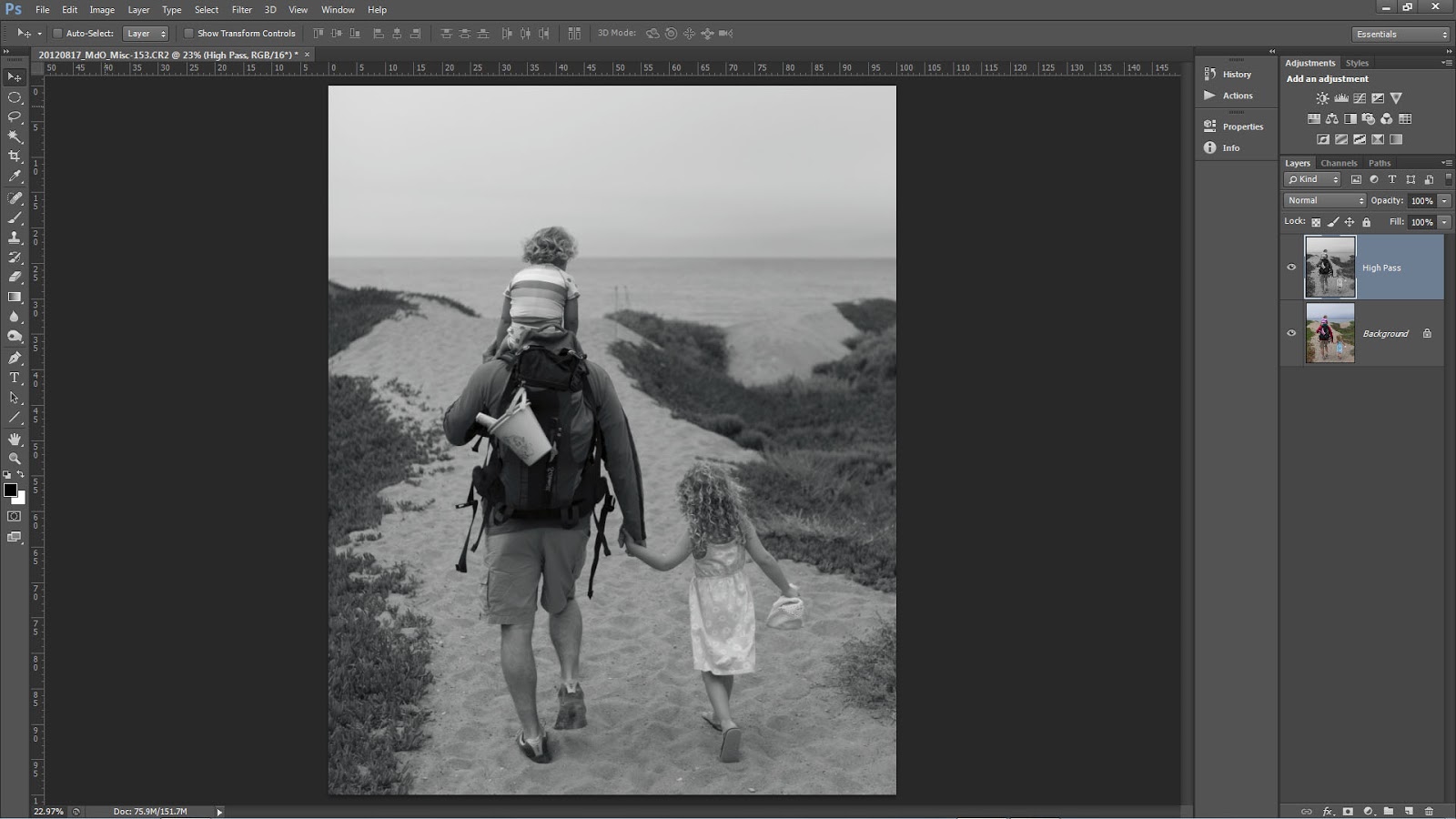
Recently, we have seen an increase in photographers using the High Pass filter in Photoshop to add edge contrast and texture detail to their images.  This is a cool technique but when you use the filter remember to add two more steps; desaturate your layer before applying the High Pass filter and always target your filter effects with a mask.


You may have seen or heard many photographers talking about how they sharpen only on the Lightness channel in L*A*B* or they make sure to change the blend mode of their sharpening layers to Luminosity or they use the Fade option with a Luminosity blend mode change.  There are many good reasons to make these switches and we suggest you use them in your sharpening or contrast boost workflow.  For the same reasons, when you use High Pass desaturate.

It is a common misconception that when you run the High Pass filter you are left with an image that is baseline 50% gray and only shows brighter or darker tonality at the edge contrast and texture detail.  Instead, High Pass may retain color information from the original image.  This can lead to color shifts or colored fringe along a high contrast edge similar to haloing.

 Notice the remaining color.
Our workflow is to copy the background layer or stamp visible if you have a multi-layer document and then desaturate via Image>Adjustments>Desaturate this can also be executed with the keyboard shortcut of CTRL+Shift+U for Windows or CMD+Shift+U for Mac.


For those who want to play or have more control you can
  • Run a Black and White adjustment instead and modify the tonality of the color arcs.
  • Use multiple layers of High Pass set to different radii.
  • Leave the color in your layer in order to generate a color boost. Watch out for fringing!
  • Use the filter on a Smart Object so you can make changes.
  • Invert your filter layer to decrease contrast and texture detail.
The second misconception is that areas that appear to be smooth after running the High Pass filter are not. Make sure to use a mask and target the filter effect to only those areas that you want to modify. In general, LIGHT does not recommend enhancing the edge contrast or texture detail on the following:
  • The sky especially blue sky.
  • Areas of constant color or tone.
  • Flowing water.
  • Out of focus areas.
  • Human skin especially female skin.

Fiat Lux!

Wednesday, October 24, 2012

Tiny Planet Mania


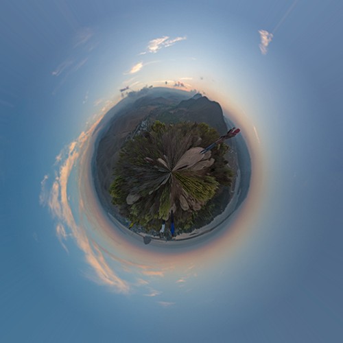
It seemed that during the California Photo Festival I could not swing a cable release without hitting a few people discussing or playing with the app called Tiny Planet.  The app manipulates an image in a pretty cool way and the result often resembles a small planet in the center of a square frame.

Although the buzz was about the phone app, the process has been around a while and there are many websites and blogs dedicated to the effect.  So for all those who do not have the app or if you have it but want to apply a similar effect to your big photos, here is the quick way to do it in Photoshop. 

Oh by the way, Jill Waterbury, Light's in house iPhoneography instructor, introduced just about everyone to the app and also requested the Photoshop method.  So here it is for Jill and anyone else who wants to play around with their images to have fun and create.

The Photoshop method works best on panoramic images, especially 360 degree panos, but can be done to any image.  To demo the process, I will start with a 360 pano I shot during Click.


The basic process is to open the image in Photoshop and then to apply a simple filter called "Polar Coordinates."  This filter is found in the Filter>Distort menu.  Of note it will only be available with 8-bit images so if you have a 16-bit workflow you will have to change to 8. (Go to Image>Mode>8-bits)  Hand in hand with the depth change you may need to convert the image to a smaller color space.  For example, Light recommends a 16-bit workflow using ProPhoto RGB.  If you go from 16 to 8, you should also convert to either Adobe RGB (1998) or sRGB via Edit>Convert to Profile.

When you choose the Polar Coordinates filter you see the dialog below.


Make sure to select the "Rectangular to Polar" button.  When you apply the polar coordinates filter you get the following image.

There was obviously a change but the filter created a "down the rabbit hole" effect and it is not a square frame, not what we are looking for.  Interestingly, this effect is found in the app but is called "tiny tube."  So before you apply the filter, you need to do two other steps.

First, go to Image>Image Size.  In the dialog box, make sure resample image is checked but uncheck Constrain Proportions.


 Go to the Width and Height text boxes in the Pixel Dimensions section and make them equal.  I normally find the smaller number and change it to the larger.  So in the example above, I get this.


Your image will look distorted but go with it.


Next go to Image>Image Rotation>Flip Canvas Vertical and the image will flip upside down.


Now we are ready to go back to the Filter>Distort>Polar Coordinates.  The result is a tiny planet-like square image.


If you have a 360 degree pano all you have to do is the process described above.  If you do not have that type of image you can still do the process.  The best types of images to use are those with a
panoramic aspect ratio, images with little detail on the top and bottom, and a strong linear shape but with vertical development in the middle, vertical third of the frame. Even with the perfect image, there may possibly be a few more steps after you apply the filter. So here goes with a normal image.


This image does not have a panoramic aspect ratio (in general vertical images are more challenging to use than landscape) but there is limited detail at the top and bottom of the frame with a linear shape along the horizon displaying strong vertical development.

For any image that is not a 360 degree panorama, the first step is to make sure the horizon is level.  After that do everything we did above.  You will get the following intermediate images.


Just as before run the Polar Coordinates filter and you get this.


There is the tiny planet but there is a seam at the top because our image ends did not match perfectly.  No worries, do a quick retouch and rotate the image to the desired angle and you get this.


A small planet with a volcano or two.  This effect can be used on all sorts of images so have fun.  Here is one more for the fun of it, this is a composite of a tiny planet and a tiny tube from the same image.


As you play remember to try the opposite effect.  If you do not flip the image you can make a tiny tube like this one. (the opposite of the image at the top of this post.)


Fiat Lux!


Friday, December 2, 2011

Don't miss Photography and Photoshop: A Creative Fusion with Ben Willmore!


Push your photography way beyond what is possible "in camera" to produce fine art imagery that takes full advantage of a purely digital workflow. Only a week left to register!


Prevent snapping
When dragging a layer or selection near the edge of a document or layer, Photoshop snaps the edge of the object you’re working with to the edge of the document, layer, or selection that’s currently active. To prevent this, hold down the Control (PC: Ctrl) key after you start dragging the layer or selection and the snapping will be temporarily disabled.

Reposition selections
Click-and-drag with the Rectangular Marquee tool (M) or Elliptical Marquee tool and then press-and-hold the Spacebar to reposition the selection before releasing the mouse button. This is especially useful when attempting to create an elliptical selection
that aligns with an existing object.

Cycle through blend modes
When the Move tool (V) is active, hold down the Shift key and press the plus (+) or minus (–) key to change the blend mode of the active layer in the Layers panel. If the Brush tool (B) or a retouching tool is active, then the same keyboard shortcut will change the
blend mode of the active tool instead in the Options Bar.

Fit on Screen
If you ever copy-and-paste an image from a larger image into a smaller one, and then proceed to transform (Command-T [PC: Ctrl-T]) the resulting layer, you’ll  find that the transformation handles appear outside your view of the document (because they’re beyond the document’s bounds). When that’s the case, press Command- 0 (PC: Ctrl-0) to use the Fit on Screen command to see the transformation handles that are attached to the active layer.

Reset any tool
If any tool is acting oddly, consider resetting the tool. Right-click on the tool icon in the upper-left corner of the Options Bar and choose Reset Tool from the menu that appears.

Multiple undos
Command-Z (PC: Ctrl-Z) works fine when all you want is to undo a single step. If you need to undo multiple steps, add the Option (PC: Alt) key to the aforementioned keyboard shortcut first to be able to apply multiple undos. You can also control how many undos are available. Choose Photoshop (PC: Edit)>Preferences> Performance and in the History & Cache section, change the History States setting.

Cycle through open windows
Press Control-Tab to cycle through the open documents in Photoshop. Adding the Shift key will reverse the direction that the documents are displayed in.

Brush to Eyedropper
Any time the Brush tool (B) is active, hold down the Option (PC: Alt) key and click on an open image to choose a color within the document to paint with. This is the same as temporarily switching to the Eyedropper tool (I).

Painting on a mask
When painting on a mask with the Brush tool (B), press X to swap the Foreground and Background colors, press D to reset the Foreground and Background colors to their defaults, and use the number keys on the keyboard to change the Opacity of the active brush in the Options Bar.

Target a layer
When the Move tool (V) is active, hold down the Command (PC: Ctrl) key and click to target the top-most layer that contains information that’s directly below your mouse position. Hold down the Shift key to add additional layers to the ones that are already selected.

Tuesday, September 27, 2011

Tim Grey- Your Digital Imaging Guru!

Tim Grey is a highly regarded digital imaging specialist that has been educating photographers for over 10 years. Tim's vast understanding of the various outlets for image enhancement, including Adobe Photoshop, Lightroom, and Photoshop Elements, has led him to write over a dozen books on digital imaging for photographers. He has also been published in several magazines such as PC Photo, Digital Photo Pro, and Outdoor Photographer.

Tim is returning to the Central Coast for a second year of teaching at the California Photo Festival, October 12-16, 2011. Each day Tim will be sharing essential techniques for photographers of all levels. His courses this year will include Fundamentals of Photoshop, Adobe Lightroom, a series on Time Lapse Video and more!

We've asked Tim why he is coming back to teach at the California Photo Festival for a second year...
© Tim Grey

What do you like about teaching at the California Photo Festival?
"Are you kidding?! It is a great event in a beautiful location with lots of incredible instructors and wonderful attendees. This is easily one of my favorite events to teach at."

Why should other photographers join you at this years event?
"It's quite simple. This event is in a beautiful location that photographers will love, it features the best photographers in the industry, and there are many other enthusiastic attendees to mingle with. Don't miss it!"

Learn more about Tim by visiting www.TimGrey.com

© Tim Grey 
Don't miss out on your chance to deepen your photography skills, with hands-on instruction from this digital imaging guru!

Click here to see all of Tim's classes during the California Photo Festival.

With 16 world-class instructors, over 150 events, and the beauty of the Central Coast, this year's California Photo Festival will be an amazing learning experience for all! Get your pass today at www.CaliforniaPhotoFest.com!

Thursday, September 22, 2011

Our Tip of the Week by Lee Varis!


The Dreadful Banding, Bane of the Photo Printer
and How to Get Rid of it!

Most photographers who print their work encounter this sooner or later. It often rears its ugly head in clear sky gradients – the dreaded banding, posterized tonal gradients that break into discrete bands that destroy the smooth appearance of the sky. This is a "digital" artifact that is mostly blamed on 8 bit files! The fact is that banding in a print can often result even with high-bit depth files during the conversion to the printer profile for output. The problem is hard to predict or pre visualize and this can result in wasting expensive paper to discover that you have to "fix" something in the file.

The following image demonstrates the nature of the problem.

sky

It looks smooth doesn't it... but, if we look at the individual channels maybe we can spot the problem...

sky red channel

The green and blue channels don't really show anything but here in the red channel we can just barely see that there might be an issue. It's subtle though so we can't really be certain that there will be a problem. The issue of banding in skies, or any smooth gradient for that matter, has been around as long as digital imaging has existed and there have been numerous attempts to solve the problem. Back in the day, when real high-end imaging was only possible using Scitex and Quantel Paintbox systems the solution was more or less the same as it is today - one has to add noise in some fashion or another to break up the bands. Outputting a file only to discover that there were bands was quite expensive so many shops resorted to adding noise as a standard procedure before outputing anything. However, adding noise often resulted in a gritty appearance and if it wasn't necessary it wasn't desireable.

One of the original Quantel Paintbox engineers, Ed Manning, invented a technique to pre visualize the bands and old timers like myself will still refer to this as "Ed's Curves" – Now its mostly referred to as "solar curves." This technique is still useful as part of our strategy to eliminate bands. Begin by duplicating the background to a new layer...

Layer Panel with Curve Adjustment

To setup "Eds Curves," make a new Curves Adjustment Layer at the top of the layer stack and, once you are in the Adjustments Panel, place multiple points on the Curve...

Points on Curve

Now, pull the points up and down so that you end up with an extreme sine wave sort of thing like this:

Extreme Wavy Curve

The result puts all the tone transitions on a mostly vertical segment of the curve so we have a lot of contrast between tones – we also have a fairly psychedelic image...

psychedelic sky

Despite the rainbow color the image shows very obvious sharp ridges running through the sky. We can leave this temporary Curves adjustment on to help visualize just how much noise we need to eliminate the ridges. Select the duplicate layer and run the noise filter: Filter->Noise-> Add Noise...

psycho sky with noise

The idea is to use enough noise to completely hide or obscure the ridges. This is the traditional approach that most prepress professionals use. The problem with this approach is that often quite a bit of noise is necessary and it can lend the image a harsh look...

Noise in sky

Sometimes this will not look as bad in a print but there is a better approach. Instead of using the standard noise filter, use: Filter->Brush Strokes-> Spatter...

Brush Strokes

The large filter dialog allows you to select multiple artistic filters intended for creating painterly effects.

Filter Dialog

For our purposes, we want to have a high "Spray Radius" and a Smoothness setting of "1"

Spatter Settings

This filter is much more effective in smoothing out bands in a gradient than simply adding noise. The only trick is in masking off the dark "spatter" of the non-sky elements at the horizon. For that we can turn to the Blending options dialog...

Blending Options

Blending Options dialog

Setup the "Blend If" sliders for the Blue channel as shown above - the idea is to blend through the dark, non-sky tones to reveal the "un-spattered" image in the Background. Sometimes you can get away with only using the slider in the top layer – here I've used both to get a cleaner image. Often you'll have to do a little bit of masking for final cleanup – add a layer mask to the "Spatter" layer and mask out the dark speckles with black.

The final result is smooth with less obvious noise...

Smooth Sky

Compare this with the original and with the noise version! Spatter breaks up the bands with diffusion instead of adding light and dark noise so there is no grittiness and no bands. At this point you can throw away the Curves Adjustment layer and print with full confidence that you have vanquished the dreaded bands forever!

Remember "Ed's Curves" and use them whenever you have the slightest suspicion that banding may be present and you can clearly visualize the 'bands" before they bite you in the butt...


Learn more incredible digital imaging techniques from Lee Varis at the California Photo Festival, October 12-16, 2011! Lee will be teaching all 5 days during the festival, discussing topics like The Digital Zone System, Mastering Exposure, High Speed Camera Techniques and more! Click here to see Lee's full festival schedule.


Thursday, August 11, 2011

Recent Topaz Webinar is Up for Review


Topaz Labs just posted the webinar I did with them a couple weeks ago.  Enjoy and, as always, send me any questions, comments, or concerns.

Fiat Lux!

Bull

Tuesday, July 26, 2011

Moonrise over the Mountains


This moonrise capped an amazing day of photography on a recent trip.  We were shooting all day with subjects varied from glaciers to brown bears to crazy, trumpeting whales and everyone was tired.  Needless to say the moon rising over the high peaks and snow/ice fields invigorated our group and we shot a little bit longer.

I used a Canon EF 400mm f/2.8L mounted to a 7D body.  A Really Right Stuff PG-02 and Induro CT314 provided the stability.  Stability was incredibly important as I was on an anchored yacht in calm water but it was still  rocking as a result of six whales lunging, diving, and surging.  Turns out 200+ tons of whale makes a ripple or two. 

The dynamic range was fairly large and in order to get enough detail in the moon I sacrificed a little in the shadows.  I shot a bracketed sequence for HDR as well but did not prefer the image to the one you see above.  Since the shadows were a bit dark I used Photoshop to bring up the tonality in the lower portions of the image. 

When I want to brighten an area I often use a Curves adjustment layer.  Instead of moving the curve though, I switch the layer blend mode to Screen.  This brightens the image by approximately one stop.  I liked the result everywhere but the moon so I masked it out and kept the original tone.


Fiat Lux!

Wednesday, July 13, 2011

Free Webinar on the 29th!


Very Old Ice with a little Topaz and Photoshop.

Hal will be presenting a webinar on the 29th of this month, noon on the West Coast, 1 PM Mountain, 2 PM Central, and 3 PM East Coast. 

He will discuss using Topaz Detail and Adjust combined with Adobe Photoshop to enhance your HDR and image optimization workflow. 

Register at the link below.

29 July Webinar

Hope to see you online!

Fiat Lux.

Wednesday, June 8, 2011

Lens Flare Technique

Victoria's IR pano of the Midnight Cellars vineyard

Yesterday's post featured a Photoshop Lens Flare filter placed strategically on my head.  If you want to use the flare in your creative process try the following technique.

Open an image in Photoshop as a Smart Object.  If you are going through Adobe Camera Raw, hold down the Shift key and click on "Open Object" (the button normally says "Open Image"). If you are already in Photoshop, right click on your background thumbnail (in the Layers Panel) and choose "Convert to Smart Object". Finally, if in Lightroom, right click your image thumbnail and choose Edit In-Open as Smart Object in Photoshop.

To add the Lens Flare, go to the Menu and click Filter-Render-Lens Flare.  This will bring up the Lens Flare filter dialog.  The radial buttons let you choose your lens category and the brightness slider controls the intensity of the effect.  Sometimes difficult to see is the third control, the small crosshair in your preview image.  Drag the crosshair to place the effect.


Once you click "Ok" a smart filter is created and the flare will be visible in your image.  I chose an IR image so you can easily see the filter effect.


The beautiful thing about a smart filter is you can go back and make changes at any time.  To do this click on the smart filter "Lens Flare" and the dialog will reopen to adjust your filter.


The Lens Flare is a great little trick to bring out every now and again.

Fiat Lux!

Thursday, May 26, 2011

Topaz Detail Webinar Replay


Here is the replay of the webinar I did with Topaz Detail a few weeks ago. 

The mask process I quickly describe is available here.

Please send me any of your questions or comments to hal@Lightworkshops.com

You can find other Topaz webinars here.

Fiat Lux!

Tuesday, May 24, 2011

"Mask" with Blend Modes for Easy Composites


The two images above do not really work for me separately.  I thought they might look better combined so I played around with them a bit.  I am not a big fan of spending a large amount of time selecting or masking unless I absolutely must.  When I do mask I use either Photoshop alone or Topaz Remask.  For this composite, I wanted to try a blend mode switch and see if I could avoid any selections or masks.  The process I used is below.


The first step was to create a stack by layering the two images in Photoshop.  I used the trees as a background and added a few Curves Adjustment Layers to fix tonal range, color cast, and add contrast (you could also do that in Lightroom first.)  At the top of the layer stack is my eagle fight shot.  I moved the eagles into a possible position and am now ready to try a blend mode switch.


With the eagle layer active I changed the blend mode to Darken.  The Darken blend mode works by displaying only the parts of the active layer that are darker than underlying pixels (in lower layers.)  I thought the eagles are darker than the sky so maybe it would work.  Unfortunately, the sky in the eagle layer is darker than the background sky.


To fix this little issue, I added a Curve Adjustment Layer and set it to affect only the eagle layer.  To do this click on the the click to clip to layer icon that looks like a dark circle on top of a light circle at the bottom of the Adjustments panel or hold down the Alt/Opt key and click on the line separating the eagle layer from the Curve layer (you will know you are in the right place when your cursor changes to the dark/light circle icon.)  When we set up a clipped layer the adjustment will only effect the layer it is clipped to.  In this case, the curve only modifies the eagle.  As I drag the curve up notice less of the sky around the eagles is visible.


I continued to move the curve up until the sky on the eagle layer was lighter than the sky of the background.  Now only the eagles themselves show up with the Darken blend mode.


Final step for me was a Black and White adjustment layer.  Not sure I will ever use the image but I like the result better than where I started and the technique is a great tool to have in your kit.  This also works in reverse using the Lighten blend mode.

The final composite

Fiat Lux!