We have been approached by a local silk scarf maker who creates beautiful, one of a kind scarves. The process that you can see on her website looks very fun and very messy! She comes in with dark colored finger tips which gently caress her light fragile looking colorful scarves and says "I can't photograph the color close enough to post on my website".
 She indeed came to the right place. Between listening to Kevin Ames, Jim DiVitale and, of course, master of the studio, Hal Schmitt, they have all shown me awesome tips and accurate techniques in the studio about lighting and post production for commercial purposes.
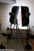
First you want to set up lights that are as balanced as you can get. We use the ProFoto D1 Air Kits along with the Creative light strip boxes. You can see in the photo I'm using 2 strips. The other softbox in the upper left is just hanging for storage purposes only.
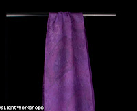
I tried the scarves on white first and got a few good images but wanted to see if black would create a more rich color. Turns out- it didn't matter once I color balanced, set my white and black points and cropped in, but I like shooting on black better. I also prefer having the option of showcasing the entire product and for me, color seems to stand out nicer with a black background.
 I hung the scarves on a C-stand to pull them away from the black background to allow the light to fall off quickly behind the subject, making the black background darker. If you are ever getting to much light on the background pull the subject forward, back up and the background will naturally get darker.
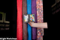
Also, make sure your camera in not in AWB (auto white balance). This could give you varying color balance in the studio depending on what and how you're shooting (thank you Hal). I put it in flash mode, but ultimately I used my trusty X-Rite color checker- incredibly important to maintain neutral, honest color in your scene. If I changed the lights in any way I would take the photo with the color checker again in case any inconsistencies came up.
 I then loaded the images into Lightroom to see how I did. Bring up the image that has the color checker into the Develop Module. In the basic tab there is a small eye dropper next to your exposure slider. Take that eye dropper and click on middle gray or 18% gray. That will help bring your color balance to a neutral state. Set your white point and your black point. Some photographers are a bit more technical than that, but I find that this method works for me.
Sync your settings to all the images with that developed image and you are color balanced and ready to crop.
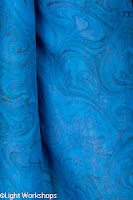
 I had a little fun with some "posing" and folding of the scarves to see what the client will like, but I can tell that that is going to be the main challenge. Have you ever tried folding silk? Maybe get a wind machine... I can't wait to get started on her other few hundred once we get a good system for her images worked out.
To learn more and get more detailed workflow instruction, come to our California Photo Festival and check out Jim DiVitale and Parish Kohanim for your commercial shoots as well as Rob Sheppard and Tim Grey for your Lightroom workflow.
Fiat Lux
-Victoria


Victoria, thanks for posting this article. I see that you used the Color Checker 18% gray sample and others to set your color balance to neutral. Did you also use the X-Rite to create a camera calibration profile? When I do this in Lightroom 3, the difference between the default setting of Adobe Standard and the newly created color profile consistently boosts the blues and purple color saturation. This would seem to make a significant difference when photographing the scarf colors. I realize there is far more to optimizing the color for a website than this, but I do find that the X-Rite is a worthwhile tool. Could you expand a little on your recommendations setting the black and white points in LR3? I remember that Jim DiVitale and Hal Schmitt had very specific recommendations regarding the black and white point thresholds, especially when considering what a printer can actually handle effectively. Thanks again for sharing this experience with us readers!
ReplyDeleteReally it was a nice photography blog...thanks for sharing this information
ReplyDeletecolor balancing